Posts Tagged: logo development
Introduction to Pixels Graphic Design – Pt. 3
The final leg in our three-legged stool is graphic design. Ryan is not only a photographer, but a skilled graphic designer who’s been helping brands for nearly 2 decades. He’s got IT, if I may say so.
Not only does Ryan create logos for businesses of all sizes, he understands branding and the visual vocabulary that goes along with creating a culture and a fully conceived brand. Some favorites are included in this blog, but if you are an entrepreneur looking for branding help, or a business in need of a brand update, my guy is your guy!
In the process of creating each of these logos and treatments, there was a conversation (think: several) between Ryan and the client to set goals, discuss the business, the target markets, and the best way to represent who they are and what they do through products or services.
We love graphic design, architectural photography and commercial photography whether logo design, brochure design, head shot photos, architectural photography or product shots. At Pixels On Paper we pride ourselves in listening to a broad range of clients and customizing our photography and graphic design services to meet each individual request. Our skills, styles, and visions come together to be a permanent record that either reflects an identity or delivers a message that speaks to thousands. We would be honored to meet with you, learn about you and your business needs. Email us at mail@pixelsonpaper.net or call 336.990.0080 to learn more, receive a quote or to let us know how we can put our skills to work for you.

This work is licensed under a Creative Commons Attribution-NonCommercial-NoDerivs 3.0 United States License
All photos are ©2020 Pixels On Paper. Do not copy, crop, or remove watermark.
Graphic Design fun
We’ve grown Pixels’ portfolio of offerings as we’ve continued to calibrate our lives over the last few years. We’ve shaped our lives, as you all have, to new normals and even newer normals, all while we try to rear a toddler, adjust our time management techniques and add new skill sets.
As you all know, Ryan is our graphic designer – as well as my husband, baby-daddy, and wonderful photographer. Recently, he’s been updating some design applications for existing graphic design clients and adding dynamism to the designs he’s created already.
A year ago, he worked on a project for our client in Asheville at the Words Communications by rebranding her business with a new logo treatment. Most recently, he added several animated gif concepts.
Several years ago, Ryan developed a branding logo for Fionix Consulting that they loved, and recently added an animated gif to their graphic design and branding mix.
I love sharing these new additions to our services at Pixels. We are professionals who capture milestones and create heirlooms, but we are also hungry creative types, always looking for ways to help our corporate, entrepreneurial and commercial clients. To see more of what Pixels can provide in the graphic designer department, check out our website and that category in our blogs.
Pixels Creates Updated Branding for Local Bakery – Indulge
Just as when your life changes, when your business changes, it’s time for a new look… and in the world of marketing, we call that rebranding. Pixels is asked to help businesses rebrand with new logo treatments and visual vocabularies all the time, but it’s particularly fun when it’s someone you know and respect. Enter Haylee Greene.
Haylee is a baker and the owner of Indulge Specialty Cakes & Baked Goods. We created her original branded logo, and businesses cards too, back in 2015. We had a blast because 1) she’s a dynamo and has been such a wonderful friend, and 2) we happen to have in common the fact that Indulge and Pixels are specialty vendors who work events like weddings. In other words, we often run in the same circles.
Haylee stepped away from the baking business for a season (and got married!) and when she decided to come back to the business, she wanted a refresh and we were happy to help.
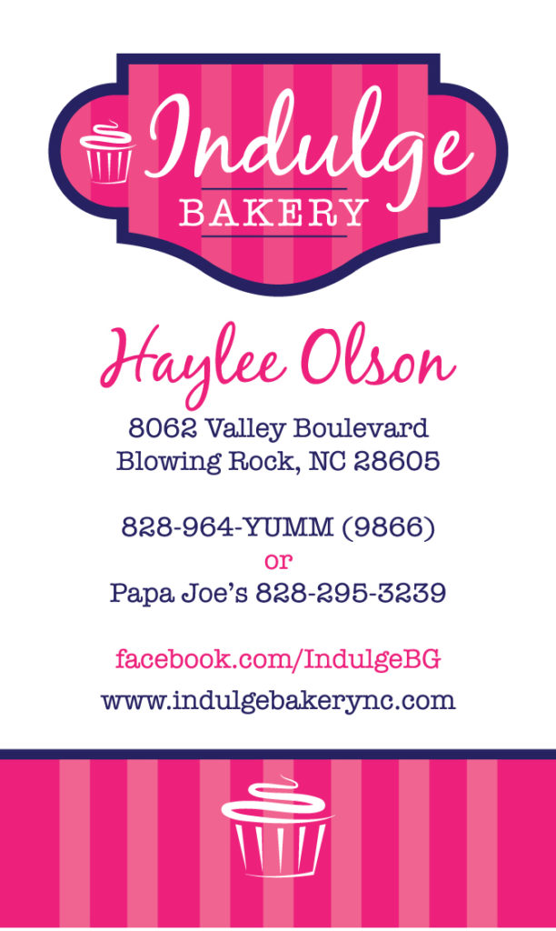
Original business card and logo for Indulge Bakery designed in 2015:
As we do with all branding clients, we started with a conversation about what she wanted from the logo in this new world and asked for inspiration and examples of what she found attractive. Haylee shared a desire for something more earthy in terms of palette and more handmade – even hand-drawn in look and feel (like her gorgeous baked creations) and provided us with some parameters. It was an overhaul and we enjoyed the challenge of making the look different, but still indicative of who she is, what her business does and appealing to the eye.
Her response from the first round of logos: “You have outdone yourself!! Honestly, I don’t know how I’m going to choose! You definitely nailed exactly what my vision was.”
First round of concepts for the updated Indulge Specialty Cakes & Baked Goods:
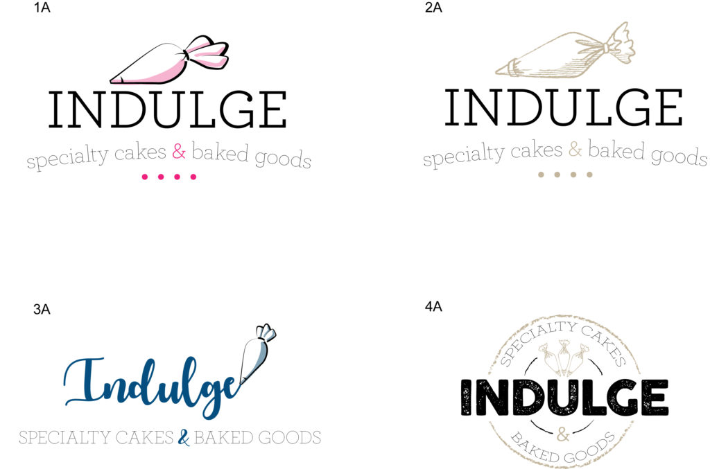
After some tweaking, we sent along a second set and she reviewed those as well. When she found the winner, she wrote us to say, “Thank you for working so hard. It seems even more important to me this time for many reasons. I love that you are so willing to help me make it perfect.”
Final logo design for Indulge Specialty Cakes & Baked Goods:

Rebranded final business card design for Indulge:
The business card design was just as fun and gave Ryan the chance to throw out some wild card ideas to see where Haylee was with thoughts on taking the branding beyond the logo. In the end, she opted for a mix of traditional and earthy, which suits Haylee as a person and how she wants to market the business.
[By the way, and not for nothing, Haylee and Indulge make crazy good cakes and cupcakes, plus AH-MAZING whoopee pies!!]
We love graphic design and commercial photography whether logo design, brochure design, head shot photos, architectural photography or product shots. At Pixels On Paper we pride ourselves in listening to a broad range of clients and customizing our photography and graphic design services to meet each individual request. Our skills, styles, and visions come together to be a permanent record that either reflects an identity or delivers a message that speaks to thousands. We would be honored to meet with you, learn about you and your business needs. Email us at mail@pixelsonpaper.net or call 336.990.0080 to learn more, receive a quote or to let us know how we can put our skills to work for you.

This work is licensed under a Creative Commons Attribution-NonCommercial-NoDerivs 3.0 United States License
All photos are ©2018 Pixels On Paper. Do not copy, crop, or remove watermark.
Some New Graphic Design work from Pixels
![]()
In the news, especially the science and environmental columns and journals for the past decade, we’ve all been learning about how our bee populations nationally are in danger and decline. If you didn’t care – or know before – you probably do now. The health of bee colonies is a significant sign of how our environment overall is doing and bees are part of a process that ultimately touches how we humans live and survive.
It’s big. That’s the macro. The micro? Most of us grew up eating honey and don’t you love eating local honey on a biscuit? …. Or take a spoonful of local honey to help with allergies? I digress.
These clients – Sherry and her husband Allen of Byrd’s and Bees Farm – reached out to us last fall to have a logo created for their business: a family-run local bee farm that sells both honey and “nucs.” These guys had a fairly specific idea for the logo mark. We talked on the phone about what they were thinking, and we took those ideas and developed options. They had a drawing that I mimicked closely that was very light and airy with more pastels as a color palette. The second option we presented was reminiscent of the vintage seed packets and the third option was a very modern, clean line, simplified honeycomb option.
Here are the 3 options we presented:
![]()
![]()
Sherry’s response to the initial designs: “Okay so I’ve been waiting on this all day!!! They are all so beautiful but by far mine and Allen’s favorite is Option 2! I am so in love with that style! The colors are beautiful and the style is perfect. I love that heart apostrophe…makes MY heart smile.”
After some tweaks we ended up with this design.
![]()
They were thrilled! Huzzah!! : “I’m so happy (giddy even) with this logo! Thank you so much!!! I love it!”
If you’ve never hired us for graphic design work, here’s a little info to tuck away. Our process is one we use that has served us well over the years. We typically listen to the client’s ideas and show them 3 options to start. Those usually follow the “rule” of show one that’s right on par with their ideas, fleshing out the detail and covering the base. The second option deviates slightly from that original client idea to add a few extra little touches that may enhance their ideas. The third option Ryan calls “the wild card.” It’s a design that’s just out of box altogether, and its mainly there to show ideas they may not have even considered.
Once a design is approved, we can also design business cards, stationary packages, brochures, powerpoint slide decks and a whole lot more.
This couple is working on their overall brand and business and when we have more to share with you, we look forward to it!
We love family portraits whether they are set in the studio, the great outdoors, a specific location like the mountains or high country, or on our property in our outdoor portrait garden. Pixels on Paper photographs, engagements and weddings, brides, and special events and portraits of all kinds in our Wilkesboro, NC studio. We would be honored to meet with you, learn about you and your family and be a part of taking special portraits that will become, we hope, family heirlooms.
This work is licensed under a Creative Commons Attribution-NonCommercial-NoDerivs 3.0 United States License
All photos are ©2018 Pixels On Paper. Do not copy, crop, or remove watermark.
